New website design at Oriolmorte.com
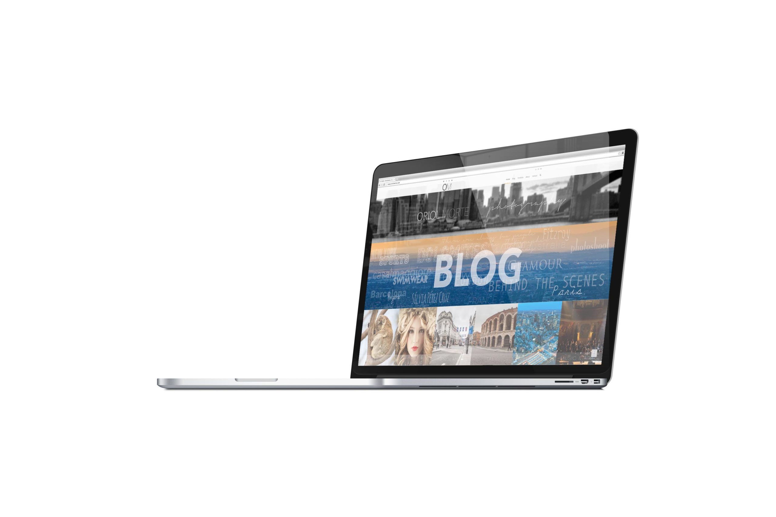
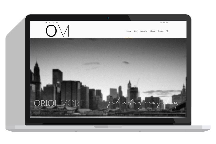
Already in 2014, more experiences to share and more pictures to show. A few months ago I decided starting to develop a new fresh website from the scratch. New design, menus, expanded the galleries and the whole site translated into 3 languages: Catalan, Spanish and English. I tried to reach the minimalism using white background and the most minimalistic AND less elements that I needed to offer the best user-experience. I have also worked out on offering all pictures retina ready. That means you can browse all the pictures in beautiful and sharp quality even on high resolution devices like MacBook Pro Retina and MacBook Pro. The new website design at Oriolmorte.com has been carefully choosen. The galleries has been changed to a gallery plugin where you can go fullscreen and enjoy all the photographies at the bigger size you display allows to.
The Blog
Since this big update you can enjoy a fullscreen responsive blog where you will see the featured image from each post and click over them to open the blog post. The white background helps on reading. Despite all the blog post until the end of 2013 are so far only in spanish, since now and as you can see through the last 3 blog posts, all they will be translated to English, Spanish and Catalan! I’ll do this big efford in order to help you understanding every single post and not only need to focus on images because the text is not understandable. I would say sorry to those english speakers who will find a number of grammar mistakes but still good enough to be understood. I thought it’s a good point to create and translate all the posts by my own in order to have more freedom and publish faster.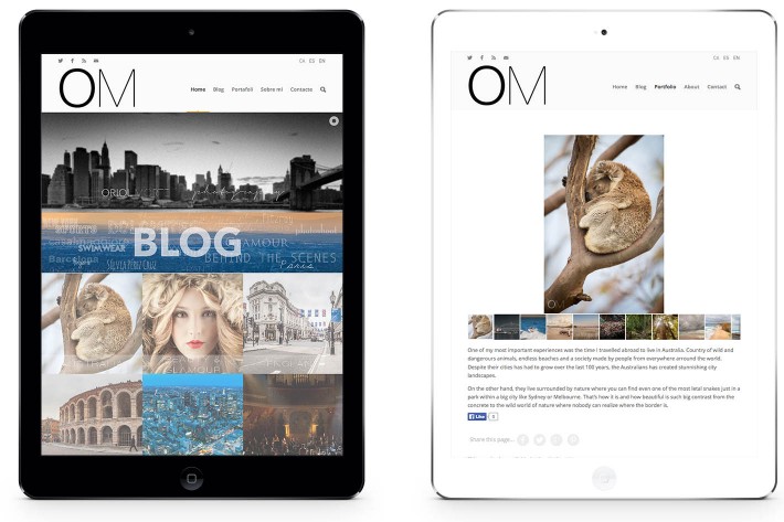
The Galleries
The galleries has been the areas where I worked out most. Since I went to Australia and New Zealand I’ve found out that the 3 main galleries “Portrait, Landscapes and Performances” were not enough. That is why I decided to keep them as the “big” category and create new sub-galleries under every category. That make the navigation more flexible with also new pictures. You will see some updates soon by adding new galleries and content.
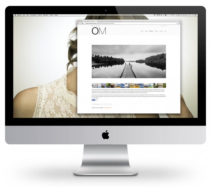
I did write several words on a few gallery pages describing the experience through the images above. I consider by using thumbnails it makes the picture navigation more comfortable.
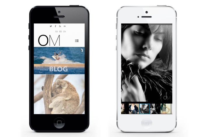
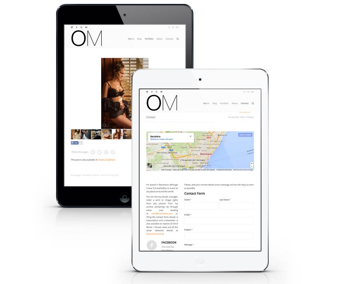
All photographies looks nice on every device you are using. Doesn’t matter the size of you’re display either 11″ or 27″ since every picture can fit on screen while on fullscreen mode keeping the quality by clicking the two arrows on top right. That will turn the background into black and give you the chance to watch the whole gallery perfectly. On mobile devices like iPhones and Android looks also nice. Although the website template is responsive I would recommend to go fullscreen on gallery pages.
Comments are closed.
oriolmorte


